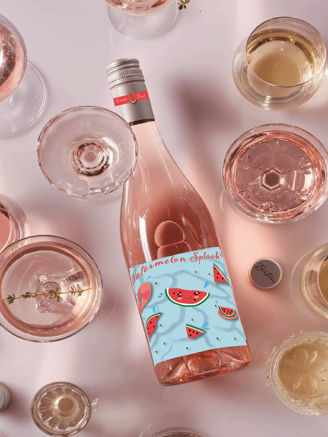
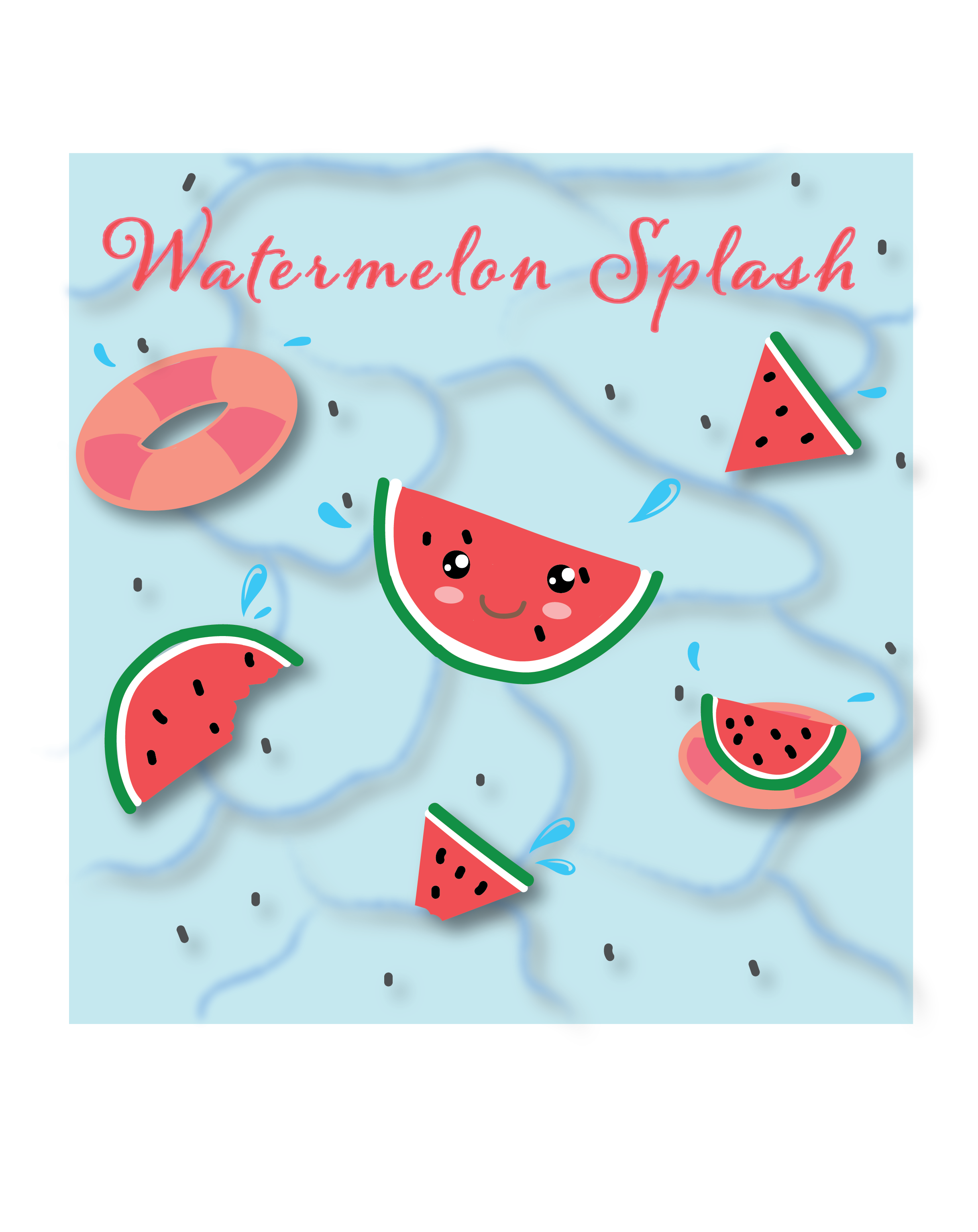
Simply Fruit wines are known for their catchy names but lacked the visual appeal to match. The redesign transforms these bottles with vibrant, playful cartoon labels that bring the fun flavors to life. Each wine's name inspired a unique design: "Watermelon Splash" features lively textured watermelons and splashes, while "Just Peachy" and "Strawberry Fields" showcase adorable fruit characters with bright, eye-catching colors These labels are bold and intriguing, perfectly matching the unique flavors they represent. I used cohesive font styles and balanced design elements, with each fruit character given a cute, friendly face for added charm.
Simply fruit wine
Product Redesign
Target Audience: Young adults and casual wine drinkers


